LSPR
Project Goals
- Revamp the identity and branding suite to reflect the modernised approach of the business, with easy-to-implement graphic systems for their staff to make use of in internal and external promotional materials
- Redesign their overcomplicated website to improve conversions and reduce workload on their end, working with them to trim excess content to improve UX in terms of user journeys
- Bring their PR & business improvement consultancy to the forefront, equal to their training services
Role: Lead Designer for Branding & Marketing, Lead Web Designer
This project was worked on as part of Webber Design.

The London School of Public Relations (LSPR) is an Aldgate-based pubic relations, influence and brand management school established in 1992 as part of the David Game College Group. It offers training and consultation for businesses and individuals and operates in the UK and abroad. They needed to update their visuals to coincide with a new, more modern approach to training and consultancy for PR.
They didn't want to stray too far from their established branding, but after numerous iterations I proposed an evolution — retain their LSPR wordmark, but tweak the colours to be more vibrant, and add a small element that we could utilise throughout the brand: a compass point, representing direction, PR and crisis pathfinding, and never feeling lost.

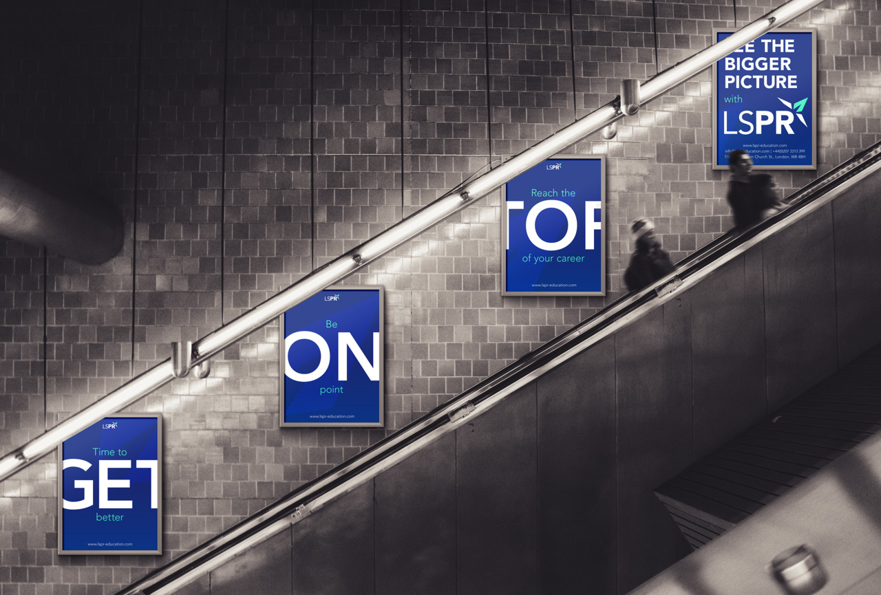
I made sure to account for the problems they faced previously: Overuse of clichéd stock photos and lack of skills to edit their own content easily. By creating these clean, striking text blocks combined with rich colour and patterns, I solved the issues.
An early campaign was based around my idea of "See The Bigger Picture". By bleeding the type off the edges and thus obscuring some of the message, I aimed to make viewers look twice (even if it's to see if it was intentional). It communicated the concept that PR messaging is not only about the message, but the wider context of any given business/sector and the subsequent impact. Furthermore, use across multiple touchpoints allows for further play on the theme — breaking up the larger message (i.e.: GET ON TOP WITH LSPR) across the posters but revealing another message individually (i.e.: Reach the TOP of your career).



One of their new targets was to become a source of industry tips/suggestions for Continuing Professional Development (CPD). Their social media presence was lacking somewhat, so I helped develop this idea into a strategy. Visually, I wanted the big, bold, blue block with useful information and an engagement prompt to become synonymous with LSPR. No more trite stock images to be used! This not only gave them an opportunity to differentiate themselves from competitors, but also gave them ownership of their brand visuals, and saved them thousands of pounds per year in stock images rights.

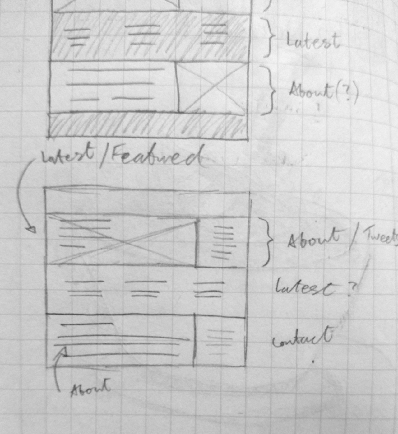
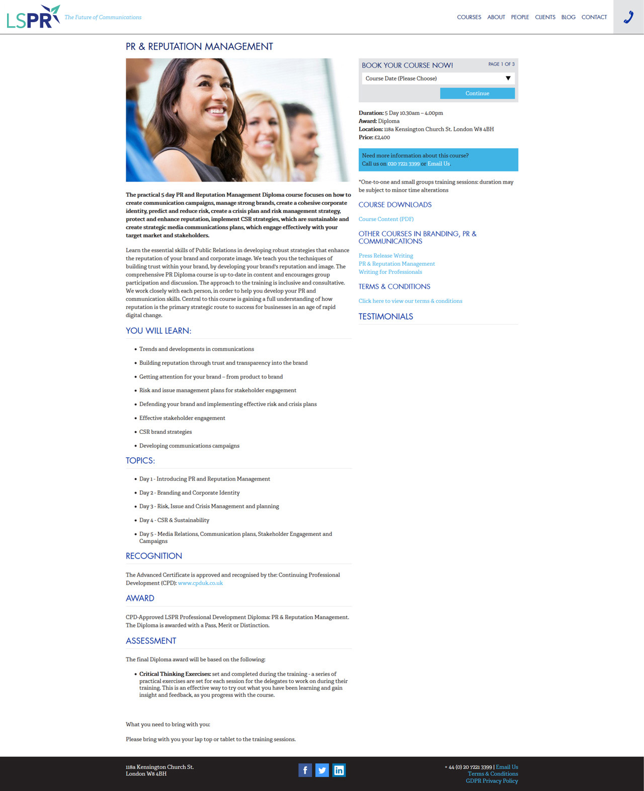
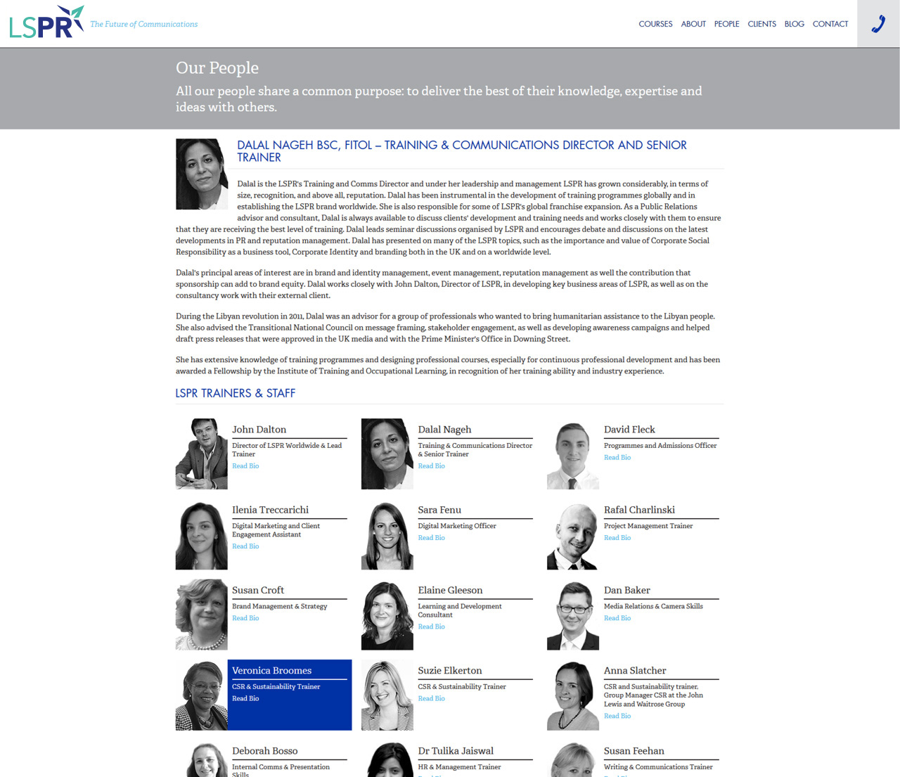
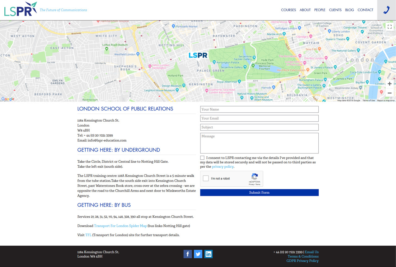
The old LSPR website was awfully complex and a real pain for users to navigate. I set about researching and developing user personas to improve the UX as well as information architecture, then designed the clean, minimal layout to prioritise easy navigation and SEO.
